React - Material UI
Contents
1. Material Design

Material은 구글에 의해서 개발 된 시스템이다.
나사, 스포티파이, 넷플릭스, 아마존, 유니티 등 당신이 아는 유명한 기업들도 다 사용한다!
그래서 이게 뭐냐? 훨~씬 쉽게 웹 개발을 하도록 도와주는 리액트 컴포넌트이다.
Material UI는 Material Design을 사용한다.
https://material.io/design
Material Design
Build beautiful, usable products faster. Material Design is an adaptable system—backed by open-source code—that helps teams build high quality digital experiences.
material.io
아래 링크로 들어가보면 좋은 예제들이 많다. 우리도 이런 페이지를 만들 수 있게 될 것이다! (언제???)
https://material-ui.com/getting-started/templates/dashboard
Material-UI: A popular React UI framework
React components for faster and easier web development. Build your own design system, or start with Material Design.
material-ui.com
store에서 무료 테마들도 있고, 유료로 추가 테마들도 제공되어 진다.
https://material-ui.com/store
React themes & templates | Material-UI Store
This is a collection of the best React templates, React dashboard, and React themes. Our collection was curated by Material-UI's creators. It includes templates and themes for dashboard, admin, landing page, e-commerce site, application, and more.
material-ui.com
2. Getting Started
우선, react 프로젝트로 이동하자.
뭐어라고~? react 프로젝트를 안 만들었니다고? go to https://jintelli.tistory.com/37
그게 아니라, npm 설치도 안했겠지!!!! go to https://jintelli.tistory.com/35
앱을 만들어 보도록 하자.
App.js 로 가서 기존 코드를 삭제하고, 아래와 같이 입력하자.
import React from 'react';
import './App.css';

function App() {
  return <div className={"App"}>
      <button>Hello World</button>
  </div>
}


export default App;
이것을 빌드시키면 단촐한 버튼만 나올 것이다.
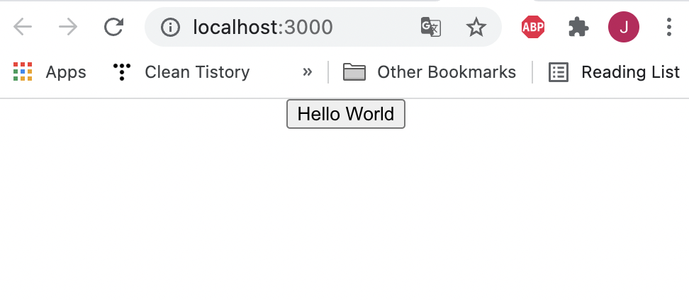
기존과 다르게 너무 허전하다. 조금씩 채워나가보도록 하자!
2.1. Installation
우선, Material UI를 적용해서 예쁜 버튼을 만들기 위해서 설치를 먼저 하도록 하자.
우리는 npm을 이용해 material-ui/core를 설치할 것이다.
아래와 같이 Terminal에 입력하자.
### with npm
$ npm install @material-ui/core

### with yarn
$ yarn add @material-ui/core
설치가 완료되었다면, 아까 전 소스코드를 업데이트 한다.
import React from 'react';
import { Button } from '@material-ui/core';

import './App.css';

function App() {
  return <div className={"App"}>
    <Button variant="contained" color="primary">Hello</Button>
  </div>
}


export default App;
@material-ui/core로 부터 Button을 improt한다. </button>으로 감싸고 있던 것을 </Button> 으로 전환한다.
그리고 variant와 color 옵션값을 추가해준다.
그리고 결과를 다시 확인하자.
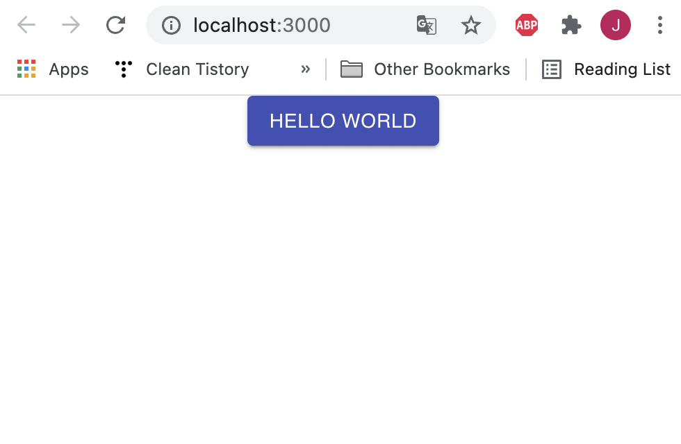
적용했을 때 잘 된다면, 당신은 Material UI 를 적용할 수 있는 개발자가 되었다!👏👏
🎉ㅊㅋㅊㅋ🎉
2.2 Button Component
버튼과 같은 이런 컴포넌트 들은 어디에 있을까? material UI 사이트를 잘 둘러보셨다면 발견할 수 있다.
여기로 이동하자. https://material-ui.com/components/buttons/
위와 같이 예제와 함께 샘플코드까지 제공해준다.
마음에 드는 버튼을 복사해서 우리의 기존 코드에 넣어서 변경해보도록 하자.
2.3 Theming
위와 같이 버튼들 하나씩 마음에 드는 Desgin을 적용할 수도 있지만, 커지면 귀찮을 수도 있다.
이 때 테마설정을 해줘서, 기본값을 설정할 수 있다. (두둥!)
우선 우리 현재 상황부터 알아보자. 우리가 아무것도 설정하지 않아도 default theme 은 제공 되어 진다.
설정값들이 궁금하다면, 아래 링크에서 확인하도록 하자.
https://material-ui.com/customization/default-theme/
테마를 적용하는 방법은 생각보다 간단하다. 원하는 테마를 정의하거나, 복사해서 붙여넣으면 된다.
예제 코드와 함께 계속 알아보도록 하자.
import React from 'react';
import { Button, createMuiTheme, MuiThemeProvider } from '@material-ui/core';
import { purple } from '@material-ui/core/colors';
import './App.css';

const theme = createMuiTheme({
  palette: {
      primary: {
          main: purple[500],
      },
  },
});

function App() {
  return <MuiThemeProvider theme={theme}>
      <div className={'App'}>
          <Button variant="contained" color="primary">Hello</Button>
      </div>
  </MuiThemeProvider>
}

export default App;
여기까지 테마와 컴포넌트에 대해서 알아보았다.
다른 컴포넌트들은 사용할 때 알아가면 되지만, 어떤 종류가 있는지 알아야 적합하게 사용할 수 있다.
Button 말고도 Button Group도 있고,
이외에도 선택을 위한 버튼들 Checkbox, Radio, Select 등 각재적소에 맞는 다양한 UI들이 있으므로 꼭 둘러보도록 하자!
다음에는 조금 더 나아가 css파일도 함께 살펴보며, 그럴듯한 가게 메뉴판을 만들어보도록 하자.
안녕
': Front-end' 카테고리의 다른 글
| GitHub Actions 이용하여 React 프로젝트에 Prettier 적용하기 (0) | 2021.12.05 |
|---|---|
| [React] 리액트 빈 프로젝트 만들기 (0) | 2021.06.18 |
| nodenv 이용해서 npm 설치하기 (0) | 2021.06.04 |


